Written by Nils R. | Dec 12, 2021 8:00:00 AM
How can
Financial Dashboard
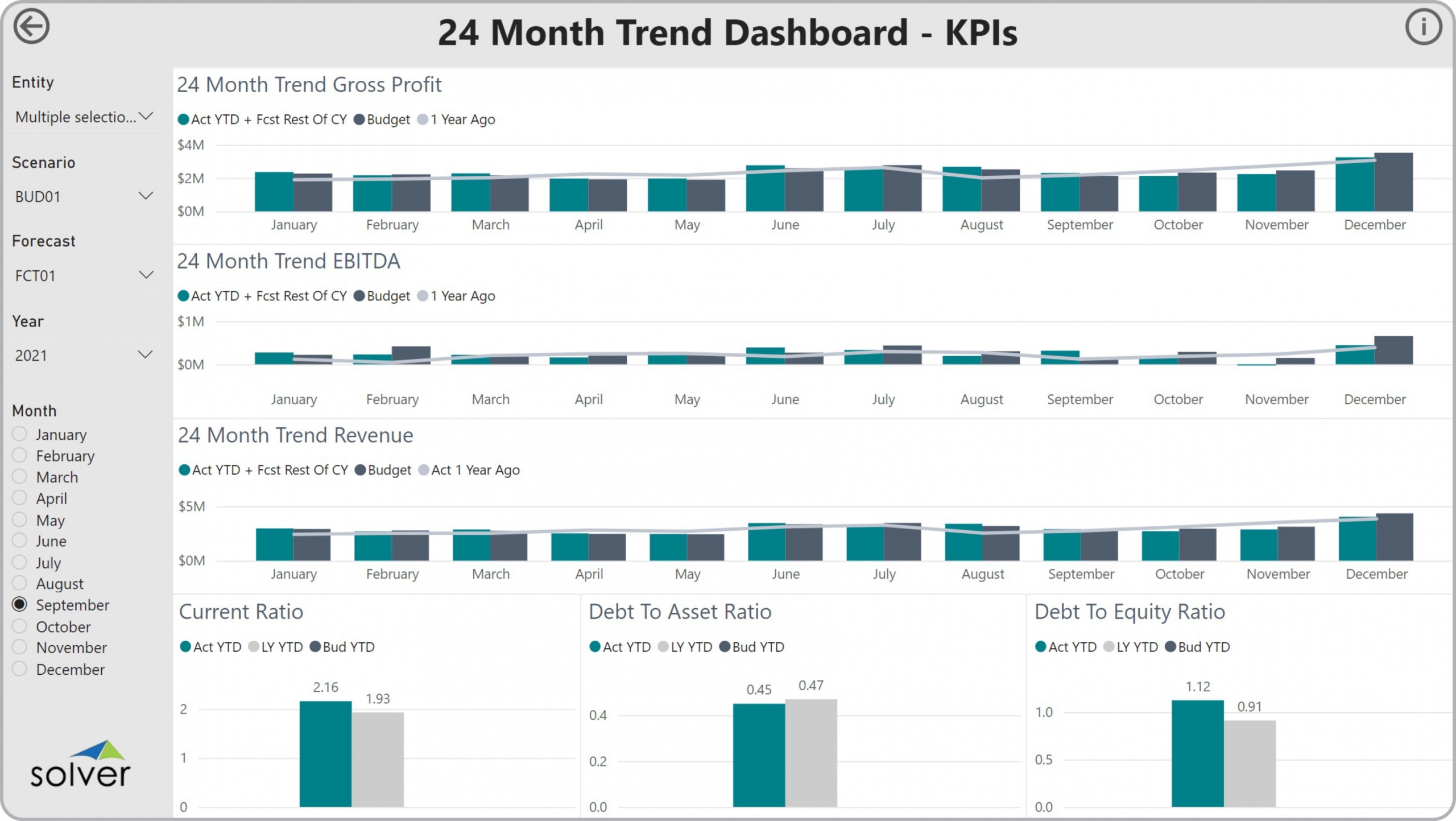
s Drive Faster and Better Decisions? As CFOs increasingly become key players in the Monthly Reporting and Analysis Process, they must rely on modern self-service corporate performance management (CPM) and business intelligence (BI) tools. Using interactive Financial Dashboards like the 24 Month KPI Trend Dashboard template shown below enables them and users from the executive team to experience near real time profitability figures and financial ratios that help drive faster and better decisions.
Who uses
24 Month KPI Trend Dashboard
s and What are Some Key Analytical Features? In today’s fast-paced business environment, CFOs are under high pressure to supply end users like board members and executives with timely and concise Financial Dashboards. Companies use key features like the ones below to support their users with effective analysis that helps drive better decisions to prepare for future risks and opportunities:

- Revenue and profit charts with auto generated estimate from actual year-to-date plus forecast (or budget) for the remaining months
- Comparison of two years of historical data
- Comparative analysis for Current Ratio, Debt to Asset Ratio and Debt to Equity Ratio

- Templates from Solver that are pre-built and that work out-of-the-box using the Solver CPM cloud. Click here.
- Template examples: You find more than 500 CPM and BI Template examples here.
- Interactive Dashboard examples: Try Power BI dashboard templates from Solver here.
- Software evaluation and selection:
- Vendor Comparison and ROI (free interactive tool)
- Evaluating planning, budgeting and forecasting functionality
- Evaluating Financial Reporting functionality
- Evaluating Dashboard functionality
- Evaluating Data Warehouse functionality to achieve “one version of the truth”
- Demonstrations and other specific assets: Solver Tour Central
- Using third party analysts and consultants to aid in vendor selection
- Creating efficient processes:
