Related Posts
- Subscription Billing Auto Forecast for SaaS Companies using Dynamics 365 Business Central
- Top 50 Opportunities Report for SaaS Companies using Dynamics 365 BC
- Subscription Sales by Contract Length Report for SaaS Companies using Dynamics 365 Business Central
- Multi-Year Profit & Loss Forecast Model for SaaS Companies using Dynamics 365 Business Central
- Lead Target Model for SaaS Companies using Dynamics 365 Business Central
Using 24 Month KPI Trend Dashboards to Streamline the Monthly Reporting Process
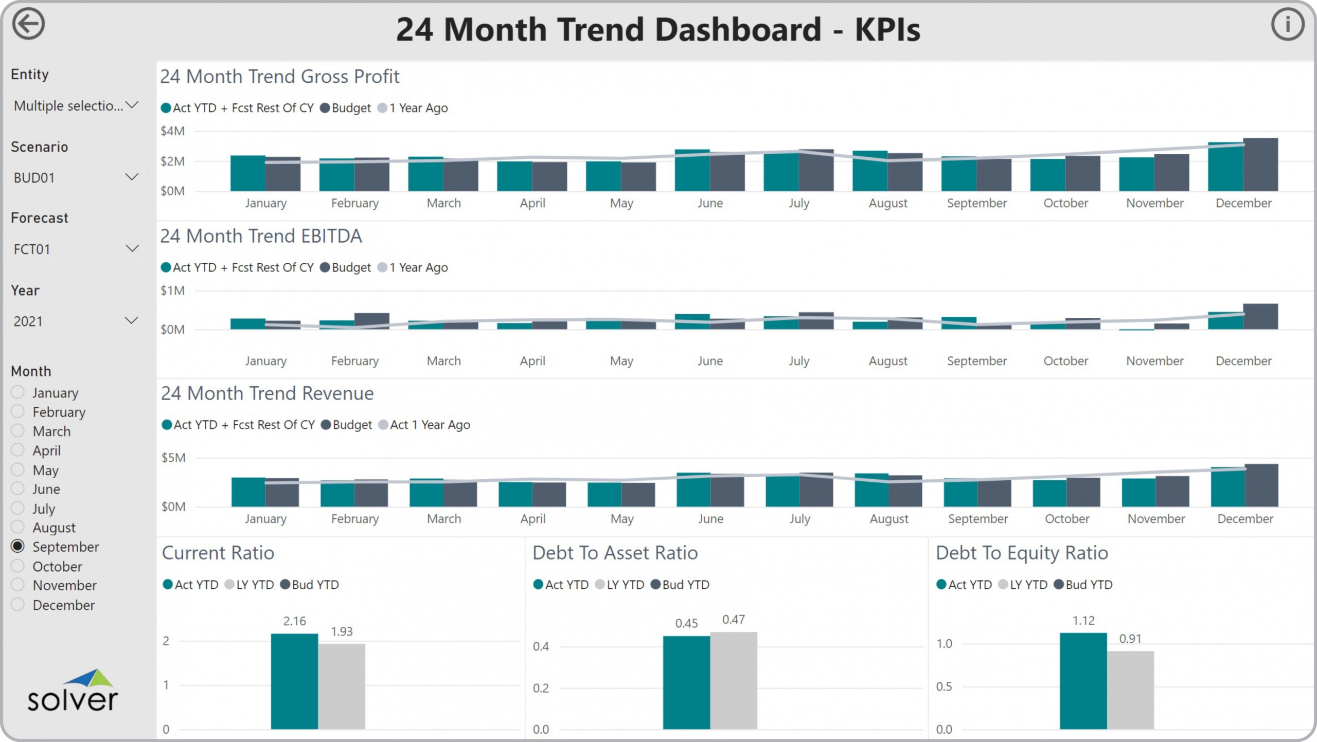
- Revenue and profit charts with auto generated estimate from actual year-to-date plus forecast (or budget) for the remaining months
- Comparison of two years of historical data
- Comparative analysis for Current Ratio, Debt to Asset Ratio and Debt to Equity Ratio
 Example of a 24 Month KPI Trend Dashboard to Streamline the Monthly Reporting Process[/caption] The 24 Month KPI Trend Dashboard is a ready-to-use Financial Dashboard from the
Solver Marketplace.
A Brief Description of the
24 Month KPI Trend Dashboard
Template Financial Dashboards like the one seen in the image above are interactive and parameter driven and sometimes contain sections with revenue, profit and balance sheet ratio trend charts that include two years of history as well as budgets for the current year. One of the important features that aid the user in the analysis process is the ability to focus in on any business metric by changing the filters on the left side of the screen and expanding a chart to a full screen view. 24 Month KPI Trend Dashboards are often used in conjunction with profit & loss reports, balance sheet reports, variance dashboards, and forecast input models.
Data Integration to Transaction Systems Most organizations these days want automated and streamlined
planning,
reporting and
analysis. However, many of the benefits described earlier rely on best of breed Corporate Performance Management (CPM) tools and/or Business Intelligence (BI) capabilities as well as data marts or data warehouses that use pre-built integrations to the organization’s ERP system. Oftentimes, they also need integrations to other key data sources like CRM, subscription systems, payroll tools, etc. Modern, cloud-based ERPs like Microsoft Dynamics 365 Finance (D365 Finance), Microsoft Dynamics 365 Business Central (D365 BC), Sage Intacct, Acumatica, Netsuite and SAP have robust APIs which allow for dynamic integrations to CPM and BI tools that are fully automated and flexible to run on a schedule or on-demand.
Additional Resources to Aid with Research of Templates, CPM and BI Tools
- Templates from Solver that are pre-built and that work out-of-the-box using the Solver CPM cloud. Click here.
- Template examples: You find more than 500 CPM and BI Template examples here.
- Interactive Dashboard examples: Try Power BI dashboard templates from Solver here.
- Software evaluation and selection:
- Vendor Comparison and ROI (free interactive tool)
- Evaluating planning, budgeting and forecasting functionality
- Evaluating Financial Reporting functionality
- Evaluating Dashboard functionality
- Evaluating Data Warehouse functionality to achieve “one version of the truth”
- Demonstrations and other specific assets: Solver Tour Central
- Using third party analysts and consultants to aid in vendor selection
- Creating efficient processes:
TAGS: Reporting, Forecasting, Analysis, Budgeting, CPM, KPIs, ERP, Dashboards, Financial Reporting, Compare CPM, Template Library
Global Headquarters
Solver, Inc.
Phone: +1 (310) 691-5300
