Nils R. | January 18, 2021
Top Dashboard Features in the Best CPM Software Apps
This article is part 4 of an 8-part series on evaluating the best CPM tools for your business. Part 4 focuses on evaluating the range of dashboard features within the best CPM software applications.
While the financial reporting, consolidations, and budgeting functionality of
Corporate Performance Management (CPM) tools are highly valuable to accounting and finance professionals, most executives want to also see the organization’s key figures represented graphically. Graphical analysis tools generally fall into two categories: 1) Static charts; and 2) Interactive dashboards. Both can be desirable because static charts can significantly highlight the most important information in financial reports such as revenues, profits, and margins, while well-designed interactive dashboards provide deep, user-guided analysis. When you are looking to acquire a new
financial reporting or planning solution and you are comparing your vendor finalists, it is important to review which of the above graphical analysis methods they provide.
Here are some of the top dashboard architectures to look for in the best CPM software solutions In general, one or more of these three types of graphical analyses below are provided by leading CPM vendors:
- Charts embedded inside financial reports
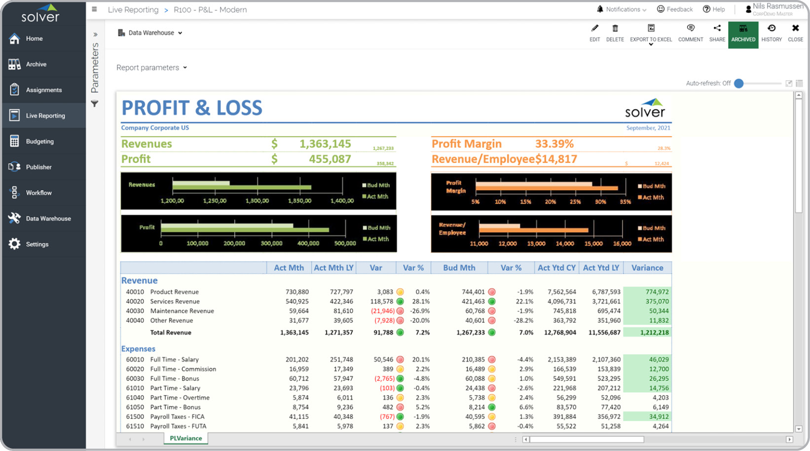
These are typically bar charts, column charts, pie charts, or trend charts embedded inside of financial statements like Profit & Loss reports and Balance Sheets. While financial report writers are purpose built, and much better than dashboard tools, to manage account structures and financial statement formatting than dashboard solutions, they can significantly benefit from charting and traffic lights to highlight the most important figures. This type of “hybrid” report is offered by some CPM vendors and should not be confused with dashboard solutions.

- Native dashboards in CPM portal
A number of CPM vendors have developed proprietary dashboards inside their cloud portals. A benefit of native dashboards is that they typically derive from the same data structure/tables as the CPM solution’s reporting and planning module. Another benefit is therefore a shorter implementation time and one place to set up user security. However, companies are increasingly investing in purpose-built dashboard solutions like Power BI and Tableau, and therefore it is less efficient to use multiple dashboard tools than one enterprise-wide solution that can easily be supported internally. Additionally, these purpose-built solutions like Power BI and Tableau offer much more advanced capabilities than most proprietary dashboards.
- Integrated best-in-class dashboards
Professional dashboard solutions have risen in popularity over the years, and solutions like Microsoft’s
Power BI and
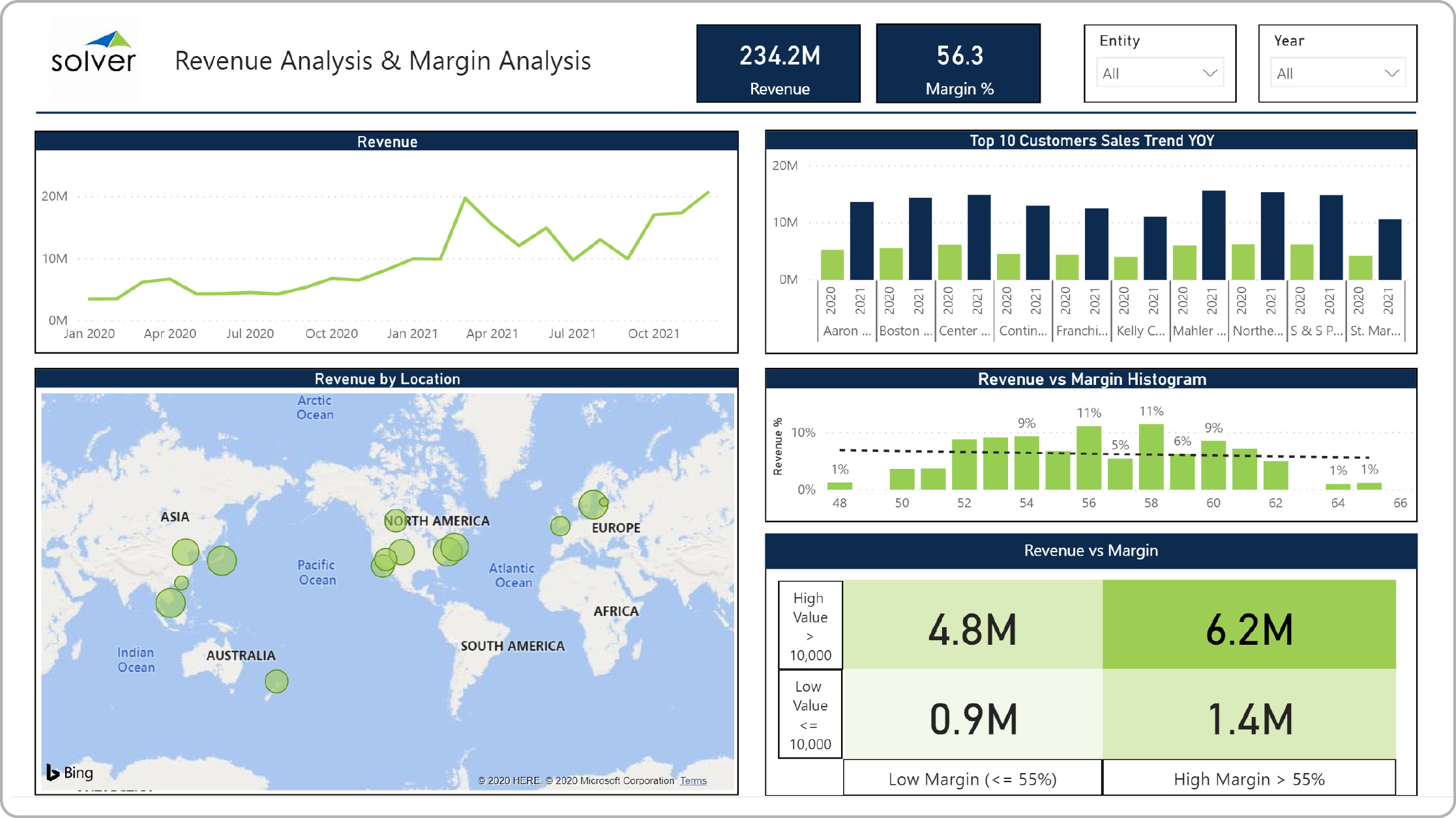
Tableau have become market leaders. Because of the singular focus the vendors of stand-alone dashboard solutions can put behind their products, the pace of development is rapid and the breadth and depth of functionality is very solid. As a result, a large number of organizations have deployed these solutions as a standard across one or many departments internally and use them to present data from their various transaction systems including their CPM solution. Based on their customers’ standardizations for these best-of-breed dashboard solutions, a number of CPM vendors have built connectors that make it very easy to pull data, dimensions, and database logic from the CPM product and into the dashboard tools. The result is a quicker implementation of dashboards, as well as a lower learning curve and a lower license cost compared to also implementing a proprietary dashboard inside the CPM solution.
 How much does a dashboard solution cost? While it is important to do your homework to ensure that the vendor you choose has the key features needed for a successful deployment, the total savings in time and effort as well as improved decision-making capabilities are just as important. Here are some things to think about when you get prices from your vendor finalists:
- Does the annual subscription from each vendor contain the same user count and modules?
- If you are receiving a discount, how long until it resets to the list price?
- Does the vendor offer a written policy for annual price increases?
- Are the implementation estimates from each vendor for exactly the same work?
A good rule of thumb is to ask each vendor for the total subscription cost for the first 5 years. Make sure this includes any potential price increases. And, if the vendor is owned by a private equity firm, chances are that they will be sold while you are still a customer so you must ensure that you receive a document stating the policy for price increases in the future – including if they are sold to another company.
Here is a free vendor comparison tool to help you compare vendors across a number of different features. This tool also includes a simple return on investment (ROI) calculator that is part of the total vendor score. Rapid deployment tools will also help speed up an implementation while reducing risk and cost.
Here is an example of the advantages of a pre-built ERP integration and how it can enable users to get immediate, “day one” benefits from out-of-the-box budget and forecast input forms, reports and dashboards.
Conclusion In summary, choosing a new dashboard solution to compliment the company’s financial reporting and
budgeting tools is increasingly becoming a strategic priority for organizations across all industries. As we discussed earlier, certain features are more important than others and can be key drivers of success, in addition to a well-executed implementation process.
Links to useful software research and evaluation assets
TAGS:
Reporting,
Consolidation,
Planning,
Forecasting,
Analysis,
Budgeting,
CPM,
KPIs,
ERP,
Dashboards,
Thought Leadership,
Compare CPM

 How much does a dashboard solution cost? While it is important to do your homework to ensure that the vendor you choose has the key features needed for a successful deployment, the total savings in time and effort as well as improved decision-making capabilities are just as important. Here are some things to think about when you get prices from your vendor finalists:
