In this article, non-profit organizations will get a better understanding of the dashboard software options they have to expand their Sage Intacct data analytics.
Whether you call them dashboards or something along the lines of data visualizations, graphical scorecards, or charts, they’re ubiquitous these days. This is likely because they are a top software priority for executives, according to
Gartner's recent study on Financial Executive International CFO Technology
. Because we are always seemingly at a breakneck pace in business, we need quickly accessible and digestible data analytics. Dashboards or data visualizations deliver exactly that – graphs, scorecards, and charts that illustrate trajectories, opportunities, and challenges through data and key performance indicators (KPIs) to better manage a project, a department, or the entire organization.

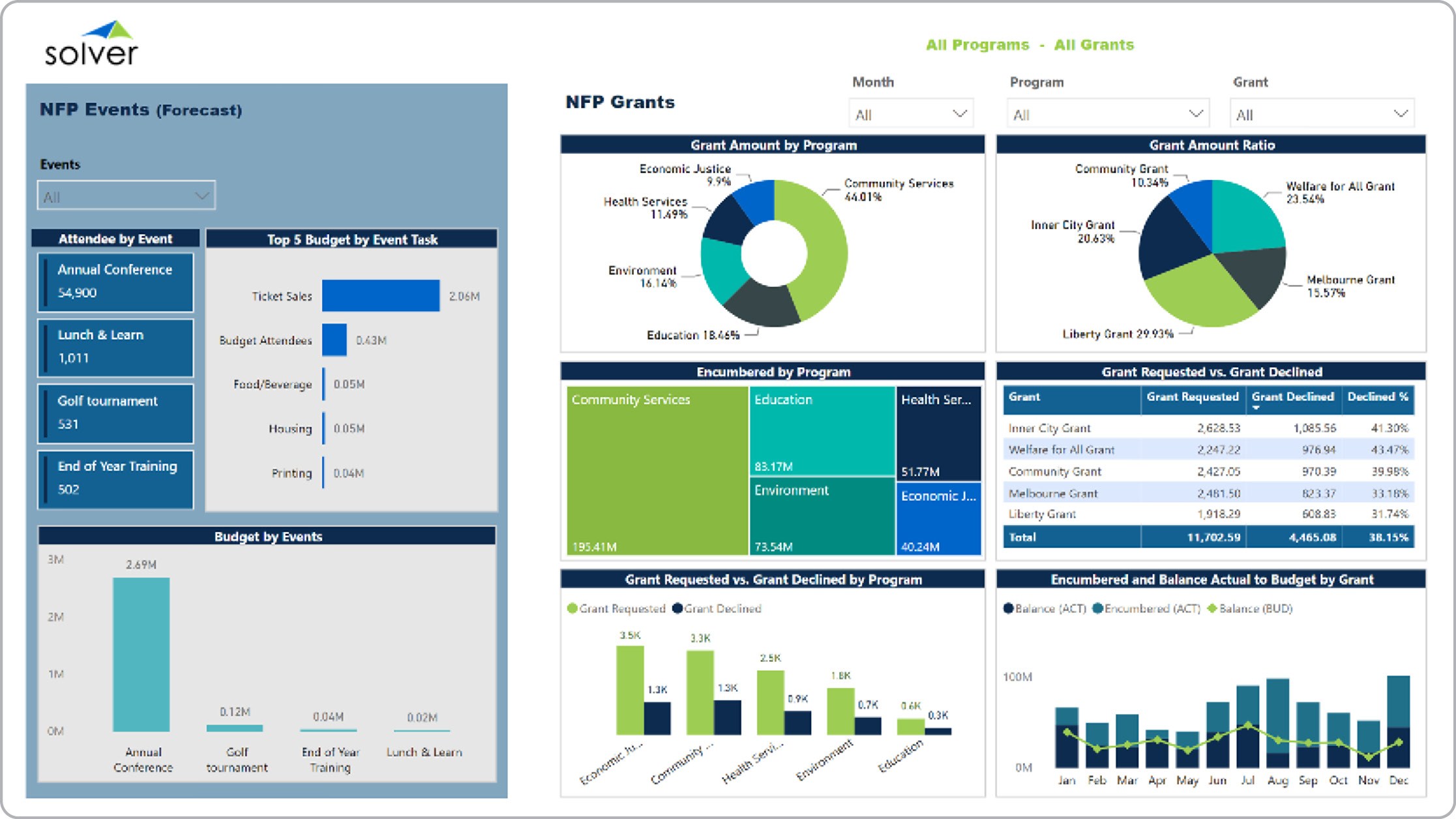
Grants and Events Dashboard Example for Nonprofit Organizations
Dashboards of all variety are pretty popular, whether you’re checking your speed in your vehicle, looking over an expenditure analysis for a credit card, or even reading an account activity report for an e-mail address. Business Intelligence (BI) dashboards are similar to these real world examples because you can better understand company data trends. But BI data visualizations differentiate themselves due to their interactive nature. You can make changes and set up your analyses to get the information you need to better understand the health of your non-profit organization. Most BI dashboards come with built-in drill-to and drill-down tools, so you can specifically analyze target data to make richer decisions. But enough about how great dashboards are in general – let’s dive into features and functionality that can help your non-profit in the form of data visualizations for a more accessible, dynamic Sage Intacct experience. Dashboards can query data from
multiple sources. Should you require real-time analyses and particularly for financial information, you can use the native dashboard abilities within Sage Intacct. Live analytics are preferred for professionals who need up-to-date financial data – or smaller organizations that can do with just basic accounting system data visualizations, without the ability to maintain a BI data store, like a data warehouse or an online analytical processing (OLAP) cube. However, larger organizations usually need more than just core financial information, as well as quicker, more powerful performance for data visualization, which you can’t typically accomplish with a live Sage Intacct dashboard.
BI data store integrations empower bigger non-profits to produce financial and operational dashboards without slowing down the Sage Intacct database when querying data for real-time analyses. If your non-profit has several Intacct users, who can be querying data simultaneously, a BI data store offers a high performance. You will have to replicate your information to the data store, but it will likely still be a faster process, depending on the size of the query. In addition, a BI data store allows you to stage other data source information in one space, such as grant project data, members, donors, etc. Some independent software vendors also offer flexibility in their solutions, so you can choose how you’d prefer to integrate your information.

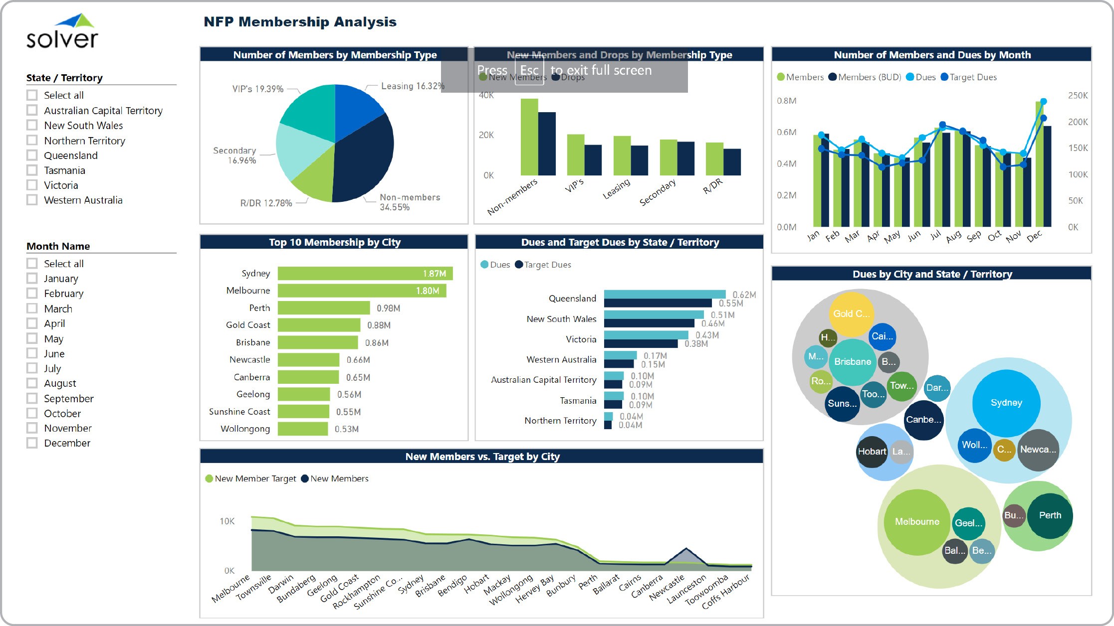
Example of a Membership Dashboard for Nonprofits
This will probably sound familiar: some organizations need a live dashboard for pressing deadlines needing updated information, but would prefer a BI data store for more regular data visualizations. Some executives need real-time operational data analyses, like development or fundraising charts. However, regular data visualizations can and usually are created using a cube or a data warehouse. The good news is that hybridity doesn’t have to be expensive. Cost is just one of many aspects to consider when shopping for the right tool. Let’s talk technology platforms. Some third party software manufacturers are bringing proprietary server dashboard tools to market. These software are staged on a platform that has been created outside of the trusted, flexible Excel. Proprietary tools might be attractive in terms of aesthetics and power, but since they’re equipped with non-Excel formatting, the learning curve for your team of end users can be lengthier. Additionally, both Sage Intacct and Excel have dashboard functionality built into their interfaces, but are for the most part
restricted in their capabilities because visualizing data is not the primary output for the software. But that explains why Excel add-in tools are so prevalent.

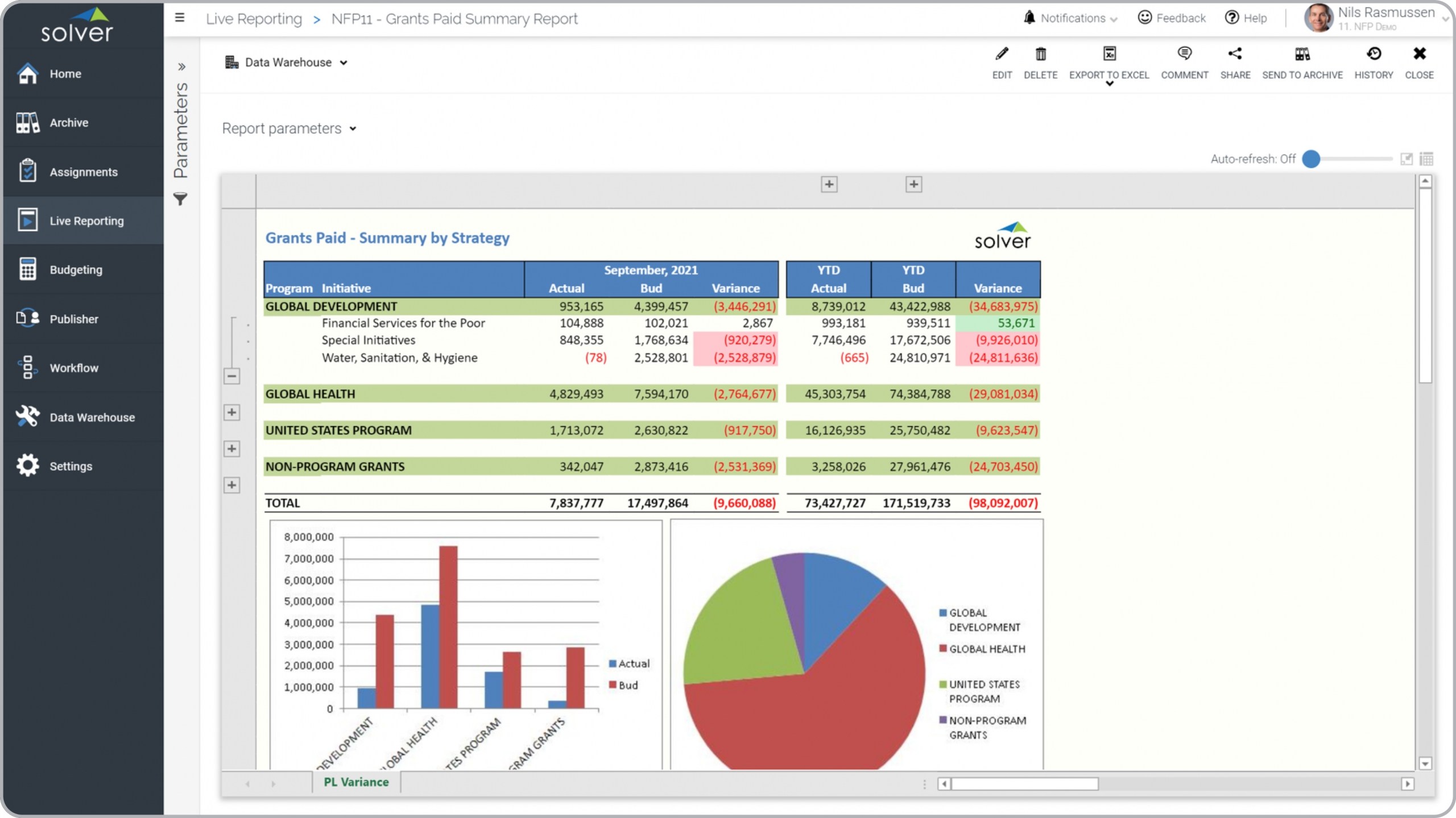
Example of Grants Paid Report for Nonprofits
Excel add-in software offers you the familiarity of the spreadsheet program paired with accelerated and upgraded functionality that empowers users to design modern data visualizations. Excel’s built-in dashboard function does allow you to produce dashboards within a workbook, but ISVs are constantly producing more robust and accessible data visualizations for business end users, as a result of consumer demands. Because of the business user friendliness, Excel add-in tools are arguably going to be the easiest to implement, but browser-based tools are going to offer the most flexible option.
Web-based solutions are now dominating data analytics, accessible from the cloud – and dashboards are right on trend. More ISVs are producing web-based dashboards, both on-premises and the Cloud, offering just as many options for data visualizations, drill-down capabilities, and KPIs. Similarly, mobile dashboard applications are becoming more popular because of how on-the-go professionals are these days, with just their mobile devices handy. Decision-making deadlines don’t pause until you can get back in the office to look at analytics, so mobile dashboards are the solution. Only some ISVs are currently offering mobile data visualizations, and because of screen size, they usually zoom in on one KPI or chart at a time. Perhaps the best news: there are some solutions that bring together all three access modes for ultimate flexibility – Excel, web and mobile. Today, it’s pretty rare for an ISV to produce a tool that provides hybridity in terms of flexible access to data visualizations. But some solutions are even sweeter: software that is part of a complete suite of BI tools. Some dashboard tools are discounted if you purchase as part of a package with other solution(s). The best BI suites are designed with fully integrated tools, security, and sometimes web portal choices, but their convenience comes from having just one team of sales, reseller, consultant, and support professionals for all of the tools. Translation: time, energy, and money saved.
What is the Effort to Implement a Dashboard Solution for Sage Intacct? Most Sage Intacct customers want their connected apps, including CPM tools and dashboards, to be cloud based. Key questions that quickly come up are: how hard is it to integrate to Sage Intacct and how much cost and effort does it take to get up and running? The answer typically is weeks or months of effort and tens of thousands of dollars in services. However, Sage Intacct software partners, like
Solver, that work very closely with Sage and its partner channel, have developed pre-built integrations as well as out-of-the-box financial reports, planning input templates and Power BI dashboards. For example,
Solver’s QuickStart integration to Sage Intacct can get a company up and running in a single day with 100+ pre-built budget and forecast input templates, Power BI financial dashboards, as well as financial reports. All of these ready-to-use templates can be selected and downloaded at no additional cost from a continuously growing
Template Marketplace. Here’s the bottom line for non-profits: if you think about how much just fundraising has changed in the past couple decades, moving from direct mail and special events to online and mobile donation, social media efforts, e-newsletters and more, on top of traditional efforts, you know that you have a lot of data to manage and analyze. Furthermore, Intacct most likely isn’t the only data source you are using, and you probably have professionals at all levels of the organization who need access to easy-to-understand analytics for more informed decision-making. Solver would be happy to answer questions and generally review Solver's Excel and web-based, easy-to-use dashboards module stand-alone and directly integrated with Microsoft's leading Power BI dashboard solution for collaborative, streamlined decision-making capabilities for non-profits using Sage Intacct.
