Written by Nils R. | Apr 2, 2021 7:00:00 AM
What is a
Labor Productivity Dashboard
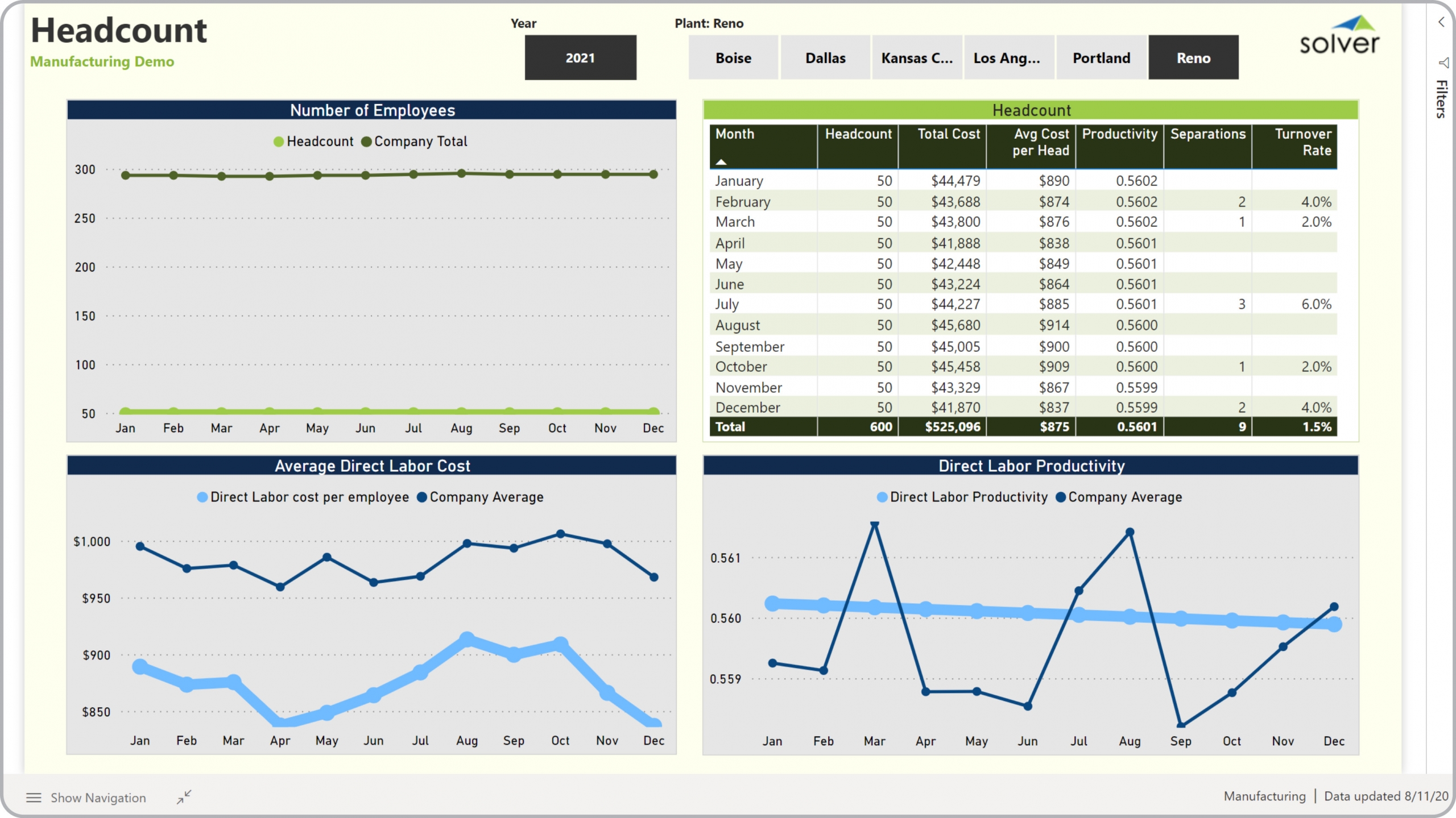
? Labor productivity dashboards are considered efficiency analysis tools and are used by Plant- and Production Managers to analyze headcount and related costs and productivity. Some of the main functionality in this type of dashboard is that it gives the user four angles of analysis, including: 1) Plant headcount and total headcount - monthly trend, 2) Average direct labor cost per employee (for the selected plant) for all plants - monthly trend, 3) Monthly metrics for headcount, total direct costs, average cost per FTE, productivity, separations, turnover rates, and 4) Direct labor productivity versus company average - monthly trend. The user can select year and plant from the top of the dashboard. You find an example of this type of dashboard below.
Purpose of
Labor Productivity Dashboards Manufacturing companies use Labor Productivity Dashboards to monitor trends in headcount, labor costs and productivity. When used as part of good business practices in Financial Planning & Analysis (FP&A), HR and operations departments, an organization can improve its revenues and margins, and it can reduce the chances that managers miss important efficiency trends or outliers.
Example of a
Labor Productivity Dashboard Here is an example of a Labor Productivity Dashboard with trends in headcount, costs and productivity. [caption id="" align="alignnone" width="2560"]


- Native ERP report writers and query tools
- Spreadsheets (for example Microsoft Excel)
- Corporate Performance Management (CPM) tools (for example Solver)
- Dashboards (for example Microsoft Power BI and Tableau)
- View 100’s of reporting, consolidations, planning, budgeting, forecasting and dashboard examples here
- View a Manufacturing white paper and other industry-specific information here
- See how reports are designed in a modern report writer using a cloud-connected Excel add-in writer
- Discover how the Solver CPM solution delivers financial and operational reporting
- Discover how the Solver CPM solution delivers planning, budgeting and forecasting
- Watch demo videos of reporting, planning and dashboards
