Written by Nils R. | Jan 8, 2021 8:00:00 AM
What is
a
Direct Labor Productivity Dashboard
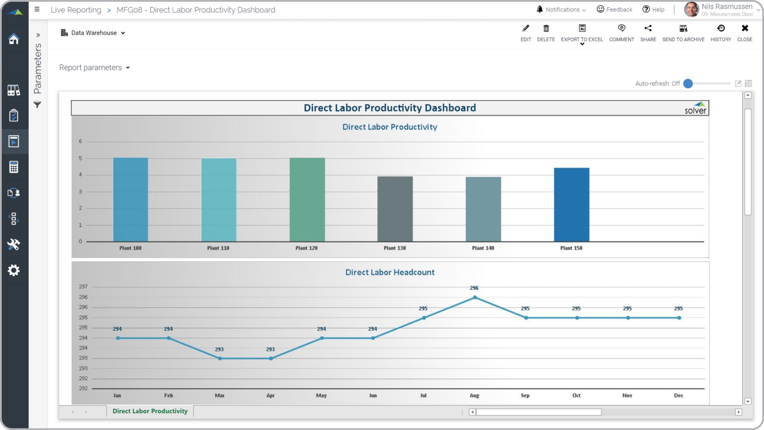
? Labor productivity dashboards are considered efficiency analysis tools and are used by production- and plant managers to analyze monthly trends in labor productivity as well as for benchmarking between plants. Some of the main functionality in this type of dashboard report is that it can be executed for any month and will dynamically display periods and plants across the two charts. The bottom of the report (not visible in the example below) shows a table with the figures for the charts. The top chart shows the monthly trend in labor productivity and the bottom chart compares productivity across all plants. You find an example of this type of dashboard report below.
Purpose of
Labor Productivity Dashboards Manufacturers use Labor Productivity Dashboards to help managers track productivity numbers in order to quickly react if there are any discrepancies. When used as part of good business practices in a Production department, a company can improve its manufacturing output and margins as well as reduce the chances that executives don’t have good visibility to the efficiency issues are discovered later than necessary.
Labor Productivity Dashboard
Example Here is an example of a Labor Productivity Dashboard to monthly trend and comparison between plants. [caption id="" align="alignnone" width="2560"]


- Native ERP report writers and query tools
- Spreadsheets (for example Microsoft Excel)
- Corporate Performance Management (CPM) tools (for example Solver)
- Dashboards (for example Microsoft Power BI and Tableau)
- View 100’s of reporting, consolidations, planning, budgeting, forecasting and dashboard examples here
- Read more about Manufacturing solutions here
- See how reports are designed in a modern report writer using a cloud-connected Excel add-in writer
- Discover how the Solver CPM solution delivers financial and operational reporting
- Discover how the Solver CPM solution delivers planning, budgeting and forecasting
- Watch demo videos of reporting, planning and dashboards
